Among the many resolves we have at our disposal to better cope is to use the leftover time from not socializing to catch up on a few good films. I’m sure that most of you have a handful of relics you could do well by re-watching. One of the films on my list is Lost in Translation.
I think it’s a great film on many levels. Bill Murray’s humour is extraordinary. On a personal level, I imagine many can relate to the struggles and feelings of displacement the film conveys with such masterfulness, and as you’ve probably come to expect, I have a special interest in the lighting.
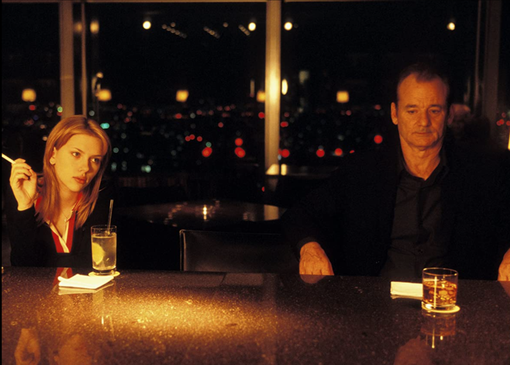
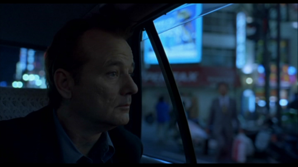
In case there is anyone out there that hasn’t yet seen the film, Lost in Translation revolves around the two main characters, Bob (Bill Murray) and Charlotte (Scarlett Johansson), who meet in Tokyo at the Park Hyatt Hotel. Bob is a weathered actor in his twilight who is going through a midlife crisis and has gone to Tokyo to cash in with less-than-inspiring work. Charlotte is a young, quiet, yet quirky introvert who is tagging along with her husband (and in life) hoping to eventually stumble upon a greater purpose.
The two find themselves feeling lonely, lost and isolated in the city and encounter in each other a lifeline of hope. They form a platonic/ borderline romantic bond that is centred on a mutual understanding of their deeper feelings towards life.
The film is densely populated with the type of feelings and emotions that tend to be left unsaid. Yet here they’re raised to the forefront against a contrasting backdrop: Tokyo. This contrast is overarching and becomes as important as the characters themselves. There is a contrast of culture, contrast of language, contrast of numbers. Contrast is presented to us in a variety of ways, a favourite of mine are the many window scenes where we see the character plotted against what seems to be an innumerable city. It is here where we find the ultimate contrast of light vs dark.
When we look at how light is expressed in Lost in Translation, we find a lit world that is much like our own. Lighting is not hyper inflated. Both in cinema and theatre, in order to help nurture an emotional response in the viewer, theatrical and cinematic lighting designers do a phenomenal job at creating hyper-real lit scenes. Lighting in film tends to be more real than the real world, and we feel it so.
Lost in Translation is different, in the sense that it has quite a naturalistic feel to it, to the point that it can feel raw. A good example of this are the few instances where spotlights are aimed slightly off. The world does not revolve around the characters of the film in the same way it does not centre on us. Relying mostly on the existing lighting conditions, the lighting design rather focuses on finding the ordinary contrasts that occur in our day-to-day lives.
Lighting is desaturated and as diffused as an overcast sky. This minimises the visual hierarchy of the brightness composition and results in our eyes needing to search for what is important. This tactic goes hand-in-hand with the subtleness of the characters presence or even impact within the scene. We tread along the film with the characters uncertain of what we should be paying attention to.
Overall, the film renders itself with soft wrapping light and muted colour tones that help frame the feelings of loneliness and isolation. Again, this is even more so when contrasted by the backdrop of Tokyo, mostly relegated to a view through a hotel window.
The hotel itself is a contained microcosm of artificial life and light. Whilst Tokyo is presented as a city washed in deep blue light, the hotel is home to warmer lighting tones. The hotel bar becomes the safe place where the characters meet and find refuge, and houses the warmer lighting tones of the film.
Lost in Translation is a romantically realistic film filled with subtle nuances that emphasises sincere human emotion and presents it as an authentic aesthetic experience.
"Spooner (the human detective interrogates the artificially intelligent robot): Human beings have dreams. Even dogs have dreams, but not you. You are just a machine, an imitation of life. Can a robot write a symphony? Can a robot turn a canvas into a beautiful masterpiece?
Sonny (the Artificially Intelligent Robot queries back): Can you?"
I, Robot (2004)
This dialogue from I, Robot is quite interesting. Spooner, the detective investigating a murder wants to distinguish humankind (or should I say human intelligence) from the artificially intelligent robot he is investigating. The argument he uses is something many would consider as the last line of defense against this rapidly developing technology: our creativity.
What if I were to tell you that the concept of creativity is not as old as you might think. Creativity, as it is understood today, is a recent concept that was popularized with The Art of Thought by Graham Wallis in 1926. Previously the word was used in reference to the divine creation. For most of human history, it was believed that only God could create something out of nothing. Humans merely replicated what God created. Modernity brought creativity to humans. Will the future bring creativity to AI?
For those that are skeptical of AI’s creative potential, it is already capable of writing music that we do enjoy listening to. Through experiment, we’ve proven that listeners, when uninformed AI produced the music, showed no distinguishable difference in preference between music written by AI or us. What is also interesting is that the same experiment also showed that this was not the case with lyrics. Lyrics written by AI simply did not speak to us in the same way.
For the moment AI is limited to recognizing patterns that have been pre-determined as creative. AI is already quite successful at replicating and reproducing these predetermined patterns into new patterns, a process that starts to become comparable to creativity. However, open-ended creativity and genuine design intent continue to be intrinsically human.
What AI has in its favour is that it can quickly draw needed information from vast databases. However, it is unlikely that a database will ever be able to cover each and every possibility. To give a simple example, the most up-to-date image recognition technology will have countless photo references of cats, yet, if a child draws a stick figure with some circles and lines, AI would struggle to recognize the image simply because it is not an image of a cat. AI is narrow. The system is only capable of working in
As long as it is not possible to fully replicate the human mind with AI, there will always be space for humans in architecture. To further this thought exercise, let’s imagine it were possible to replicate the human mind, but even then there would still exist barriers between us. The human experience (therefore most of our knowledge) is entirely based on our experience with the world through our bodies. How would AI understand this if it does not have a body that it can experience the world with? A body limited by mortality.
Another interesting question is would we even be receptive of artificially intelligent creativity? Could there be another form of creativity? Sonny’s answer is very interesting as it highlights a potential reality that many would probably prefer to avoid. Over time, the bars we have set in order for AI to be considered intelligent have been continuously rising. Originally the Turing test, Jeopardy, then chess, Go, Natural Language processing, etc. The moving standard AI must meet before we consider it intelligent, is also a standard far too high for the majority of humans, if not all. The danger in this is that long before AI reaches this standard, it most likely will have already surpassed us. Do we also need to raise the bar for human intelligence and creativity?
Should we be afraid of the insidious rise of AI in architecture? There are many who are. The generalized argument against AI mostly revolves around the loss of jobs and the potential problems its rise may cause society. However, if we look at history, what we will find is that alongside technological development and the automation of labour, is also the continuous redefinition of our roles in the workforce. This redefinition of what we task ourselves with has kept us employed. You may argue that in the long run, this cycle may not be economically sustainable and will inevitably lead to the obsolescence of human labor, thus creating problems to the current economic model. (As a side note, perhaps what we should be doing is questioning our current economic model).
My personal view is that humanity has no good reason to want to keep doing the burdensome and mind numbing work of the past and should look forward to spending the precious time we have with tasks that are more fulfilling to both our inner and societal growth.
I think it is inevitable that AI will force us to question what it means to be an architect and designer. In this brave new world, we’ll need to reformulate the questions we are asking about the creative professions and let go of the fastidious tasks that do not require human creativity. When this happens, the traditional definitions of architecture and design will no longer be the same. I can imagine the architect / designer role transforming into a sort of emotional compass to a project. It is likely that in the foreseeable future our design decisions will continue to be made by, or at least verified by humans. We should continue to develop AI so that it can become an important tool that supports the creative process. When and if AI does become creative, surely more creativity in the world can only make it a better place.
A special thanks to Ismail Saadet and Rob Anderson whose interesting conversations helped inspire this blog.]]>
I think it will not come as a surprise to learn that the word poetry has its origin in ancient Greece. It derives from the ancient word poiētēs. What is interesting is that poiētēs had at the time a very different meaning to the word poetry today. It meant ‘to make’, and was simultaneously understood to mean both the ‘construction of beauty’, and the ‘beauty of construction’. In ancient Greece, a poet was the ‘maker’ of that beauty.
‘Poetry of space’ is considered by many to be the art of shaping volume and materials. However, I find that there is ambiguity in this statement, as an important part of “space” in architecture is found where there is no material. It is in the space that is void of brick where you find greater meaning. To give an example, in a home, the outer walls and roof fulfil the function of providing shelter but it is within the inner space that you fulfil the act of living in your home. Perhaps “poetry of space” can better be understood as an intangible relationship between materials and void that only exists as an experience lived by a user.
The poetics of lighting design is fundamentally tied to these concepts. The experience of architecture, of a space, is predominately visual, meaning it is fundamentally dependent to light. Yet despite the concepts sharing a common birthplace, they are different. I admit that the differences are subtle but it is within these subtleties that the beauty of lighting design lays.
My search for a Grand Theory of Lighting Poiētēs is by nature an unfinished one. This blog today is merely a line in the sand marked by the discovery of this deeper etymological connection of the word poetry to the practice of architecture and design. As I’ve attempted to understand the poetics of lighting design throughout my career, I’ve come to recognise a set common ingredients that have consistently played an important role in my practice. The significance of their presence in my work may vary from project to project but they are consistently important to what I do.
Purpose – a function that transcends the physical aspect of a design, only tangible as the act of experiencing the design. The purpose of a design is not always clear but it is important for the lighting designer to find its clarity. From purpose, design intent can emerge and this is an essential element to the poetic process. Design intent tells us what the design should be and how it should connect to the user. For lighting, this means how it will communicate with the user. This level of clarity will guide the designer in the many creative decisions necessary throughout the realisation of the project.
Sense of Place – an emotional basis from which to construct. It is important to understand the identity of each individual location. The poet-lighting designer will draw upon direct and/or indirect references to the natural landscape, the existing common architectural language, the current and historical local culture, and uncover, if possible, the local archetypes that have shaped the local collective mind throughout its history.
Intuition – it is a peek into the centre of our minds. That place where we are as creatively free as our true self can ever be. Intuition is just that, a peek. It is probably not possible to fully understand the thought processes behind intuition. At best, we post-rationalise what came to us naturally. But listening to our intuition is important, as it somehow knows how to focus on what is important and cut off the unnecessary and irrelevant distractions.
Contingency – Architecture and design are contingent by nature. These are disciplines that exist in a world of uncertainties as they are dependent on external factors that cannot be controlled. At best they are managed. A lighting design requires a brief, it will have a limit to its budget, is reliant on the materials available at the time and on the building mastery of the builders. And these are just a few of the most obvious. There are more subtle and difficult dependencies such as social norms, the upbringing of the individual, the boundaries of what it is to be an architect or a designer, etc. It may seem odd that I consider contingency to be an ingredient to the poetic process but somehow it is. It is the struggle of the designer and their resolve that drives us to go beyond what was previously thought to be possible.
Technology – lighting is fundamentally a technological discipline as it implies a technological mastering of materials. Whilst this statement is apparently obvious with artificial lighting, it is equally true for daylight as the lighting designer seeks to control natural light to suit our comfort. A mastery of lighting design requires a mastery of the tools available to the lighting designer.
Improvisation – It is only recently that I have considered this ingredient to be part of the poetic process. I have previously considered improvisation as a method to resolve a particular type of contingency but now I see it as an important part that deserves acknowledgement. Building a project is a tremendous challenge and I am yet to complete one that does not encounter the unexpected adversity. Yes, these can be a cause for frustration but since they are inevitable, they must be faced if the design is to come to fruition. Learning how to overcome this struggle is an art in itself and accepting an element of improvisation, as a natural human response to the unexpected deserves recognition.
Experience – Keith Richards once said, “the greatest thing about songwriting, it’s not an intellectual experience.” The same is true for Architecture and Design. The grand finale of any design will always be the experience of the user. And the experience of the user will always be just that: An experience – free from the intellectual journey, from any preconception of what the space should or was expected to be. The project is complete and out of the designer’s control. The experience has become what the space, therefore the design, is. For me, this sovereignty of the experience is poetic in itself.
]]>English writer Samuel Taylor Coleridge coined the term in the early 19th century to describe one’s willingness to suspend their critical faculties in order to allow themselves to briefly believe in something surreal. It is a sacrifice of logic and rationality for the sake of enjoyment and pleasure.
When we read a novel, listen to a story, watch a film, etc., there is something taking place in our minds that allows us, for that brief duration, to fall into a world of imaginary. In other words, we’re willingly ignoring our basic understanding of reality because our desire to become part of whatever imaginary world is being laid out in front of us is too great.
A good example of this is Peter Pan in the play ‘The Boy Who Wouldn’t Grow Up’. Anyone who watches the play doesn’t truly believe that Peter Pan can fly. It is also true that they do not believe in magic and that they have a well-enough understanding of science and gravity to know that the plot of the storyline is fictional. Yet, at that moment when they are in the theatre watching the eternal boy fly with the help of fairy dust and happy thoughts, their desire to engage with the story supersedes all. They are willingly suspending their disbelief despite having a clear sight of the suspension cables that the actor uses to swing over the stage. They are not interrupting the play by shouting out that it is impossible for a boy to fly. They are willingly choosing to ignore their understanding of reality because they want to believe in the fantasy of the story.
It is clear to me that Suspension of Disbelief is, for the most part, an internal process. However, I also suspect that one’s surroundings, or more especially the lighting environment we find ourselves in, can facilitate this process.
To return with the example of the play Peter Pan, one could argue that Suspension of Disbelief is a far richer experience when the lighting hierarchy and brightness composition of the theatre presents the audience with dim auditorium wall lighting to a point where the audience forgets the confining auditorium walls are even there. We could ask ourselves how engaged would the audience be if the stage lighting rather focused on the suspending contraptions and cables instead of the actor? We would probably find it quite distracting from the plot.
Now to flip this on its head and look at an opposite example. We’ve all heard the saying: ‘a room that is well daylit with walls painted in light colours will feel ample and larger than it really is’. I think this provides us with a hint towards the crux of today’s thought experiment. What is lighting doing to make the room feel ample if the room’s dimensions have not physically changed? Lighting is revealing a bright room where there is more to see in greater detail, not that the room is larger.
At a 1st glance, these 2 examples seem to be fundamentally different. However, I would argue that they originate from the same lighting principals. Our willingness to suspend our disbelief is influenced greatly by what the lighting design is revealing and concealing from us. What do we experience when we selectively conceal? We divert our attention to what is revealed and consciously (or subconsciously…) ignore what is concealed. What do we experience when we hyper-reveal? An overload of visual information giving us the impression that what we are seeing is ampler than it really is.
The common ground of the 2 examples is the perceptual influence lighting has on the viewer. Once we get our heads around this concept, then we understand the importance of lighting in the architectural experience. Today’s blog is a good reminder that our basic understanding of the world is predominantly visual. All visual information is light and inevitably, it influences how we experience and understand the world around us.
]]>As can be expected, I’m recollecting the many marvellous lighting experiences I was lucky to have had during my holiday, but more importantly, I’m building up my own personal map of the world of architecture and light. This map exists only in my mind and is undoubtedly biased to what I’ve seen of the world. It expresses itself by reshaping borders, and disproportionally increasing areas that have had a greater impact on me, and decreasing areas that have had less or that I haven’t yet had the fortune to visit.
What is becoming obvious to me is that the fictional borders I’m creating with this map are based on my perceptions of world cultures. Needless is to say that there are large blank areas, such as Africa and Central and South America. This doesn’t worry me because, given enough time, I’m confident they’ll be filled in.
This visit to Israel has now given me the confidence to start to detail out the Middle East. However, I think it is important to say that visiting alone is not enough to build up this map. The exercise will require some research of cultural and architectural history, an understanding of current geopolitical affairs, and most importantly cross-referencing this knowledge with what I’ve actually witnessed.
The exercise will most likely take some months but it will be well worth the while and will naturally impact all other lighting impressions that the world has given me. Stay tuned to see how the map takes shape…
]]>This past weekend I had the pleasure of visiting this installation by light artist Christopher Bauder (founder of Whitevoid) and musician Kangding Ray. Skalar is an art installation that explores 8 different emotions through the medium of light and sound.
I experienced 4 of the installation’s emotions. Whilst it wasn’t obvious to me whether the emotions that were being expressed related directly to any specific human emotion as we understand them, such as happiness, fear or hope, I did interpret them as emotions. This lays the questions: what were these emotions and how did the installation (in other words, the environment I was in) enable me to feel them?
The emotional response a person has to a space is predominantly triggered by light. I believe this to be true. After all, the majority of our understanding of our surrounding environment results from light reflecting off surfaces, entering our eye and reaching our visual system.
I’m using the word predominantly because I’m willingly ignoring the other senses such as touch, smell, taste and hearing. You could even argue that taste is completely negligible and shouldn’t even be mentioned on this list. After all, how likely will the taste of anything we’re eating effect how we feel about the built environment?…
Nonetheless, this is obviously my own bias towards light. After all, I am a lighting designer. My intuition has told me for years the lighting designs I attempt to create have the potential to influence the user’s emotions. And I feel that some truly do.
But could it be that the emotions I am aiming to trigger are not yet quite well understood? That language is yet to name these emotional reactions to our environments. It’s possible. Placing the question in this manner somehow sidetracks me to think about those who experience the world through their TV, phone and more recently virtual reality.
In the past, I’ve criticized (maybe unfairly) those who limit their experience of the world to these mediums. I’ve claimed that they will always lack real-world sensory experiences. And it seems that virtual reality has the ability to make it even more so. But there is something to learn about this transformation of bits and bytes into experiences.
It might well be that VR nerds are cracking the original question of this blog. Their sole focus is to artificially recreate real-world experiences through the virtual, and in doing so they have placed themselves in a position that is best equipped to understand how the virtual lighting scene influences that experience.
Art installations such as Skalar create a sort of augmented sensorial experience that is so impactful that time itself feels slower as you go through the experience. It is important for lighting designers to learn from this.
http://www.christopherbauder.com/
http://www.whitevoid.com/2018/02/05/skalar-art-installation-and-performance-at-kraftwerk-berlin/
]]>
I have to admit that this has never happened to me before. However, the statement needs to be put into context: the project at hand is a luxury resort and the space in question is the bathing area of the single and double villas. So yes, candlelight is perfect!
Today I want to dive deeper into this, that is, try and focus on: Why is candlelight perfect? At first, this may seem like a pointless question, we all know that candlelight is the apex of “romantic lighting” and for most of us, using candlelight to create intimate environments isn’t really rocket science. You don’t need to be an experienced lighting designer to understand that the warm, dim and slowly moving candlelight can trigger in us feelings of calm and relaxation. The real question is: why does this happen? Why is this reaction to candlelight so common to us? It seems to be consistent throughout all humankind, irrespective of ethnicity or culture.
These questions brought me back to the early days of The Dark Art when we were trying to decipher potential origins to our reactions to light. At the time, we were naturally led down the path of evolutionary theory and found many correlations in our current understanding of the early relationship of the first humanoids with fire.
To cut a long story short, during the early days of human evolution, fire offered us a different relationship to light than sunlight. During the dark, cold and dangerous night, fire was an important source of light, warmth and security. It was a key tool for survival and mastering the use of fire was essential for the success of our species.
Early humans realized this importance and understood that the light from a flame is fundamentally different from the light of the sun. To start, we can control it and this is important because it allowed for us to have a deeper and more personal understanding of it. Fire is usually positioned on the ground or at a low level, meaning that the characteristics of its light and shadow are different to daylight. The most obvious difference being the fact that firelight comes from below and daylight from above. Firelight creates a slightly distorted shadow because of how close we are to the light source and its shifting movement is continuously revealing and concealing our surroundings adding a sense of mystery to what is being lit.
These characteristics were so impactful that we started to develop belief systems around the importance of fire. Zoroastrianism, a religion that is currently still in practice and is considered to be the oldest religion in human history, has fire worshipping at its centre. Scholars also believe that the act of fire-worshipping even predates the Homo sapiens species.
What this means is that humankind’s use of firelight even predates humankind and this is the true origin of our close relationship to candlelight. For millennia, we’ve gathered around the campfire with those who are close to us, to stay safe and keep warm, to strengthen social bonds and also to fall in love. This is why our reaction to candlelight is so hardwired into our DNA; this is why candlelight is perfect!
]]>The Museum reclaims an old WW2 telecommunications bunker and adds to the already rich portfolio of refurbished bunkers in Berlin. The project was completed last year so there was some anticipation up to the visit and I’m glad to say that the architectural project and museum meet and surpass expectations.
For those that have followed my work with The Dark Art, you may know that John Pawson is an important reference of ours as we have used some of his work as positive examples for the use of darkness in lighting design, the most prominent being the Stone House, a temporary installation designed in 2010 for the Interni Think Tank Exhibition in Milan.
The museum tour begins in a darkroom completely void of light. The visitors are warned in advance that they will be entering the darkroom as it can be unsettling for those who fear darkness or who are claustrophobic. The darkroom is a preparation for what is about to come. Once inside, a calming music is played and the tour guide explains that the prelude to help the visitors decompress and prepare themselves for the exhibit. The experience is indeed relaxing and lasts a few minutes however I have strong suspicions that there is an ulterior motive to it.
Although the mental and emotional decompression exercise indeed plays an important roll in how the museum is experienced; my suspicions are that the darkroom is a preparation period to allow the visitors sufficient eye adaptation to the low lighting levels. The lit environment of the museum is quite dark so if visitors suddenly entered from the daylit environment outside, they would be unable to adequately see the exhibit. It’s a touch of genius that also has a tremendously positive impact on the overall experience.
The Dark Room is also the only location where the tour guide intervenes. Besides time control and their availability for questions, visitors are allowed to walk freely and uninterrupted throughout the space. The tour is divided into 2 large rooms without partitions: starting in the basement room where you spend the 1st half, from which you are then transferred after 30 minutes into the 2nd room on the ground floor.
The artworks and objects are displayed without any written information. As explained by the tour guide, the intent is simply that the art be experienced. The museum’s view is that the act of reading is taking you away from the experience itself.
Once inside, what one encounters is an architecture and lighting design that are entirely focused on the objects on display. The room is very dark, almost difficult to see, and even when you do pay more attention to it, the interiors are completely void of finishes and decoration with the original bare aged concrete and building structure truthfully exposed.
Great care was given to the lighting of the museum. It is a project that takes contrast and focus to a new level. Many artworks are lit with precise silhouetted beams, e.g. the photography displayed on the wall is lit with a rectangular beam that perfectly fits the silhouette of the frame. This draws our full attention to the artwork, as there are no distractions with the darkened surroundings.
What pleases me, even more, is the great care that was given to darkness. The overall experience would not have been possible in a brighter space. However, it’s not only the lighting levels that are worth highlighting as even the cast shadows play an important role in the lighting design. Many of the spotlights (the ones that are not silhouetted) are positioned in such a way that they cast shadows onto surfaces that contribute to the overall composition. The most obvious example is the columns located behind the objects displayed. Because you are allowed to walk freely, including behind the artwork on display, this detail adds another layer to the overall experience.
And finally: the Interior Lake. The lake is reminiscent of the original site conditions as they were found when John Pawson and Désiré Feuerle visited the site for the 1st time. As was explained in the preparation room, during their visit they encountered flooding in the basement. John Pawson decided to maintain the water and dedicated a significant portion of the basement to it.
The lake has an interesting effect in the overall museum environment as the water surface emphasizes the calmness that is experienced. But even here, nothing was left to chance as artificial ripples are created on the water surface to bring life to it. The ripples are extremely soft and almost unnoticeable. I will even say that it is almost unbelievable that they are not natural; if it were not for the tour guide answering my very specific question, I would have been convinced. The ripples create a subtle play of light as the water surface reflects and refracts the interior. Another great example of John Pawson’s fabulous work.
During the tour, there were some spaces that were not yet complete such as the Inscence Room. I can only imagine the intensity one must be able to smell when we are void of light and vision. This experience alone is a good reason to return to the museum.
The Feuerle Collection
Hallesches Ufer 70
10963 Berlin
Germany
http://thefeuerlecollection.org/
Arch. John Pawson
http://www.johnpawson.com/works/the-feuerle-collection/
http://www.johnpawson.com/works/stone-house/
The Dark Art
www.thedarkart.org
Eye Adaptation
https://en.wikipedia.org/wiki/Adaptation_(eye)
This past weekend, I went to see a dance performance at a local theatre and as I watched, I found myself noticing how the ensemble changed their overall composition throughout the show. The ensemble was constantly playing with its form, switching between symmetry and asymmetry. This was true not only for the overall composition but also for the individual dance choreography.
The shift between symmetric and asymmetric was very intriguing to me. It created a dynamic feel that made me more interested in the performance. The symmetry created a sense of group stability and balance and the asymmetry added an unpredictability that would grab my attention.
After the performance, I decided to look it up and as was expected, the technique of playing between symmetry and asymmetry is well understood in dance. A fair portion of the art of choreography relies on the balance between the two as an excessively symmetric dance will be monotonous while an excessively asymmetric dance is too chaotic causing us to equally lose interest.
I started to wonder if this could be applied to other disciplines and a technique used in music came to mind: syncopation. Syncopation is when the accent of the rhythm falls on an off-beat in an unpredictable way. This unpredictability takes the listener by surprise and gives the music a certain level of suspense, it plays with the expectation of the beat and the anticipation created by the delay of the actual rhythmic accent. This technique is used greatly in modern music and studies have proven that music that uses syncopation moderately are more danceable as the mind fills in the gaps with movement.
Now back to lighting. The Dark Art has many times expressed that lighting has the ability to play with our expectations and desires. What these two examples are telling us is that what we have previously referred to as desire is nothing more than the anticipation of the peak ascent. They tell us that we’re naturally attracted to the play between expectation and anticipation and that this can be achieved by carefully breaking the expected symmetry with just the right touch of asymmetry. I see great potential in these concepts for the lighting design world. Although we cannot oversimplify such principles by trying to directly apply them to lighting, the ability that lighting has to conceal and reveal hints at a potential interpretation of these concepts. I admit that further thought and experiment are necessary but I look forward to experimenting in the near future.
Dance Performance, Symmetry & Asymmetry
http://dancehelp.com/choreography/
Syncopation
http://journals.plos.org/plosone/article?id=10.1371/journal.pone.0094446
Bruno Mars Syncopation
https://www.youtube.com/watch?v=nK4erl_dqJE&list=PLZTvCA3my3S7Wjhg5dTCB3uPUNelqlqeM
The Dark Art
www.thedarkart.org
The project was designed by OMA architects and according to the tour, the project team was presented with a strict set of requirements imposed by the building authorities: the new build had to be attached to the neighbouring buildings, respect the heritage of the location, including a courtyard (typical for Berlin) and allocate 20% of the total area for residential living, etc.
In an act of creative defiance, OMA architects presented their Dutch clients with a proposal that included an independent building in the shape of a cube, this 1st volume would become the new Dutch Embassy; and a 2nd volume, fully detached from the 1st and separated by a courtyard. It was built along the neighbouring buildings, thus fulfilling the remaining requirements as it also housed the residential apartments. The 2 volumes are linked through a series of bridges.
According to the tour, the original brief was for the new embassy to symbolically represent transparency and be open to the public. This was without any doubt an unusual request for an embassy due to the sensitive nature of diplomatic confidentiality. To meet the brief, OMA architects designed within the embassy building a publicly open and serpentine-like pathway that would start at the 1stfloor entrance, spiral up through the various floors circulating around the entirety of the building and end on the top floor with the potential to continue to the roof (the stairs to the roof are closed to the public).
However, the construction of the project coincided with the tragic terrorist attacks of 9/11 in New York and since then, security policy was altered to not allow public access. After some deliberation, the Dutch embassy found an adequate balance between the original design intent and the new security policies that had been set in place; public visits are now possible but require online pre-approval.
To now get to the experience of the tour: there are a number of intricacies that make this project unique. The materials used: concrete, aluminium, wood, glass, etc. are all exposed and presented to the visitor in a raw form. I believe this to be a reinforcement of the concept of transparency. The concept is taken to such a level that even the suspended ceilings use perforated metal sheets because, for this project brief, the inner working of the building’s mechanical services are equally worthy of the visitor’s eye. All the rooms have a window or view to the outdoors. There is only one exception, a meeting room that due to floor plan is landlocked. But even this landlocked space has more to tell as, after further inspection, you can find a window in the floor opening downwards to the public foyer, a noble effort to achieve transparency considering the floor plan constraints.
The building also presents a complex interlacing of floors, where levels and half-levels fold over one another. The public pathway is part of this complexity as it unfolds in a sort of dance around the various spaces. The tour guide described how this creates a fascinating relationship with the users of the building as they end up creating their own personal mind map of it all, a mental plan that guides them through their workplace. This plan develops slowly over time growing with each new discovery.
And now, what I consider to be the true moment of discovery during my experience of the architecture: at a certain point in the pathway, the visitor gains sight of a diagonal void that is cutting through the 2ndvolume. The void is designed in such a way that it is perfectly framing the Berlin TV, a lovely moment of architectural detail that is harmoniously, and with precision, placing the building within its surroundings.
Due to security restrictions, photos of the interior are not allowed.
]]>The Centre houses many institutions, businesses, cultural initiatives, etc., and amongst them is the “Everyday Life in the GDR” museum that is currently exhibiting an interesting temporary exhibition on GDR industrial design (product design for those in the US). This section of the museum has free entry.
The temporary exhibit is called “Alles nach Plan?” and roughly translates to Everything according to Plan. The name has an obvious interpretation of how a drawing plan should guide a production line but I suspect that it’s also hinting at a deeper political reality. The GDR was obsessed with the control of their population and the industrial designers of the era had to live and design in these circumstances; they were forced to become a tool of the GDR propaganda.
The GDR and SED party considered foreign designs and products as symbols of Western decadence. In sight of these views, a so-called “Formalism Campaign” was set in motion and it aimed at creating divisions between Eastern and Western design. To action the campaign, the “Amt für industrielle Formgestaltung” (Office for Industrial Design) was created.
The office’s objectives were to promote an aesthetic style that was driven by political ideology, coherent social stability and the socialist planned economy. To a certain extent, these objectives were achieved as they created the designs that are now in the exhibit at the museum, but it also backfired as it highlighted one of the most important drivers of the style.
Design is a neutral and pragmatic discipline. Although there is no clear singular definition of design, it’s generally accepted that Form follows Function. Design sets itself out to find solutions to functional problems within certain boundaries and constraints.
One of the characterizing features of DDR furniture design was the use of particleboard as an alternative to wood. The decision of DDR designers to use this material was not based on any particular quality that made it superior to wood; it was based on the short supply of wood in the GDR. In other words, design form did not follow function, it followed trade barriers.
In the aftermath of the reunification, there was a public rush to replace GDR products with products from the West. Why this rush? Surely they did not all suddenly become outdated? There are many factors that could have influenced it: it could have been an attempt to eradicate the old political and social structures, or simply the desire and ability to buy something new, who knows? What I ask is: is it possible that the collective conscious understood that the core principle of design had been tampered with?
Maybe I’m holding the design pedestal too high but in a world of divisions, is it possible that the collective conscious understands the underlying neutrality of design? And if that were true, would we not be able to use design as a tool to bring us together, a sort of safe place or topic where diversity can join to openly discuss, debate and design? I think so and discussing, no matter what the topic, is always the starting point of any solution.
http://www.kulturbrauerei.de/
http://www.kulturbrauerei.de/gelaende/geschichte/
I travelled to Iran’s capital, Tehran, to attend the Iranian Lighting Design Conference (ILDC). I recommend the conference and luckily, I was able to meet with a variety of different professionals from the industry.
As I went from meeting to meeting, I would look out the taxi window and pay attention to the people, the architecture and the differences between urban quarters. I noticed an unusual amount of large-scale projects spread throughout the city, but many of them were either at a slow pace of construction or completely paused. The impression this left on me was that the Iranian people had ambitious aspirations for their city but that the city also felt the weight of international sanctions.
My meetings with local industry colleagues proved to be very important as it again reminded me of the differences between business cultures. Lighting design in Iran has a very well defined method of how things work and understanding this is essential for any lighting designer that aspires to be successful.
In the West, lighting designers pride themselves as independent professionals with no direct links to the supply chain (manufacturing and distribution). That is not to say that this is the case for all lighting designers but most professional bodies make this a mandatory requirement and I abide by this philosophy as well.
The crux of this issue is that a lighting designer has a professional duty to provide an unbiased service to their clients; in other words, to provide the best possible design that considers with the entirety of the market and not only a limited product range of a specific company. The reality of the Iranian market is different, what the local companies provide is something they describe as a “Full-Package”. This service includes design, engineering, supply and installation with the additional after-service option of maintenance.
There are a variety of reasons that lead the local industry in this direction. To begin with, the client prefers to not have to pay for the design service (although we all know that nothing is free, the design costs are simply hidden within the cost of purchase); 2nd, the Full-Package provides absolute control over what is offered ensuring that the design stays within the know-how of the installer; and 3rd, the solutions put forward are realistic as independent designers are not always aware of the supply difficulties that the project might suffer from due to trade barriers.
This reality was strongly emphasised by everyone. The architects I spoke to expressed liking the idea of working with an independent lighting designer but had a fair amount of doubt whether it would be viable in Iran.
I think the way forward for the lighting professionals of Iran must lay somewhere in the middle ground. There is no easy short-term answer as the core concept of independence is contradictory to the Full-Package deal provided by the local companies but it is important that designers work at bridging this gap!
]]>